
Posted on May 17, 2025 | Frontend
Build a Music Player UI (HTML & CSS Project)
Hey Devs!
Today we will learn how to build a Basic Music Player UI in HTML and CSS.
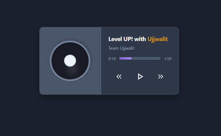
Here is the glimpse of what we will be building
The project is super simple and fun. You will learn how to use CSS variables, flexbox, positioning, responsiveness and many more.
Stick to this guide, we will cover everything step by step.
Prerequisites
Before starting, make sure you're familiar with basic HTML and CSS. If you need a refresher, check out our Free HTML guide here and Free CSS Course Here.
1. Setting Up The Project
-
Open up your IDE, we will be using visual studio code for this project but you can use an online compiler too like One Compiler.
-
Select a folder or create a new folder
-
Inside the folder create two files
- index.html
- styles.css
- Optional - Install the live server extension in VS code. This help you view your code changes in real time.
2. Analysing the design
Before jumping straight into the code we must think of the approach for the design. Let's break the design in parts to start developing them in order.
- The design consist of center main element let's call it the
music__card - Inside the card there are two parts, the
left__containerandright__container. - Inside the left side we can see a vinyl record.
- In the right there is the music content.
- In the music content the
song__titlegoes at the top. - Then beneath it the
song__author - Then beneath it is the progress bar with timestamps
- Then at last there are the control buttons.
The above steps might seem unnecesary to write but writing them helps you look forward towards a modular approach. To design something think from high to low. Meaning try to identify the parent and then go to the center grouping children and their grandchildren together.
3. HTML Setup
- Press
!+Enterto get the html boilerplate. Update the title for the project like shown below.
<!DOCTYPE html>
<html lang="en">
<head>
  <meta charset="UTF-8">
  <meta name="viewport" content="width=device-width, initial-scale=1.0">
  <title>Music Player UI | Ujjwalit</title>
  <link rel="stylesheet" href="styles.css">
</head>
<body>
</body>
</html>
-
In the body add a div with class
music__cardwith two children theleft__containerandright__container. -
Inside the
left__containerdiv add these lines
 <div class="record__frame">
  <div class="record__highlight"></div>
  <div class="record__ring"></div>
</div>
- A frame for the record
- A small white highlight on the record
- The center record ring
- Then in the
right__containerdiv add these lines.
<div class="song__title">Level UP! with <span style="color: #cf911c;">Ujjwalit</span></div>
      <div class="song__author">Team Ujjwalit</div>
      <div class="progress__bar__container">
        <div class="timestamp__before">0:19</div>
        <div class="progress__line"></div>
        <div class="timestamp__after">1:59</div>
      </div>
      <div class="song__buttons">
        <div class="previous__btn"><svg xmlns="http://www.w3.org/2000/svg" height="24px" viewBox="0 -960 960 960" width="24px" fill="#e8eaed"><path d="M440-240 200-480l240-240 56 56-183 184 183 184-56 56Zm264 0L464-480l240-240 56 56-183 184 183 184-56 56Z"/></svg></div>
        <div class="play__btn"><svg xmlns="http://www.w3.org/2000/svg" height="24px" viewBox="0 -960 960 960" width="24px" fill="#e8eaed"><path d="M320-200v-560l440 280-440 280Zm80-280Zm0 134 210-134-210-134v268Z"/></svg></div>
        <div class="next__btn"><svg xmlns="http://www.w3.org/2000/svg" height="24px" viewBox="0 -960 960 960" width="24px" fill="#e8eaed"><path d="M383-480 200-664l56-56 240 240-240 240-56-56 183-184Zm264 0L464-664l56-56 240 240-240 240-56-56 183-184Z"/></svg></div>
      </div>
    </div>
- A song title div with a span element to make the orange text with inline css
- A song author div for writing the author name
- A progress bar container with 3 parts
-
- The initial time stamp (Before the progress bar)
-
- The Progress bar
-
- The final time stamp (After the progress bar)
- A song buttons container
-
- The Previous button SVG
-
- The Play button SVG
-
- The Next button SVG
Note: The SVG might look complex but you can get your own icons from Google Material Icons. You can choose the size their or edit the
heightandwidthattribute in thesvgtag.
4. CSS
1: CSS Variables (:root)
:root {
  /* Main Theme Colors */
  --primary-bg: #1a202c;
  --card-bg: #2d3748;
  --text-primary: #f5f5f5;
  --text-secondary: #a0aec0;
  --accent-color: #805ad5;
  --accent-hover: #6b46c1;
  --left-container-bg: #4a5568;
  --record-bg: #171923;
  --record-border: #718096;
  --record-ring: #edf2f7;
  --progress-bg: #4a5568;
  --progress-start: #805ad5;
  --progress-end: #a78bfa;
  --button-text: #f5f5f5;
  --button-hover-bg: rgba(255, 255, 255, 0.05);
  --play-button-hover: #805ad5;
}
Key points:
- Centralized theme colors with CSS variables.
- Enables easy color updates and consistency.
- Covers backgrounds, text colors, accents, and UI elements.
2: Body Styling
body {
  font-family: 'Segoe UI', Tahoma, Geneva, Verdana, sans-serif;
  background-color: var(--primary-bg);
  display: flex;
  justify-content: center;
  align-items: center;
  min-height: 100vh;
  margin: 0;
  transition: background-color 0.5s ease;
}
Key points:
- Uses system font stack for clean typography.
- Flexbox centers the music card vertically and horizontally.
- Full viewport height with no margin.
- Smooth background transition on theme changes.
3: .music__card (Main Container)
.music__card {
  background-color: var(--card-bg);
  color: var(--text-primary);
  border-radius: 12px;
  box-shadow: 0 10px 20px rgba(0, 0, 0, 0.3);
  display: flex;
  overflow: hidden;
  width: 450px;
  transition: background-color 0.3s ease, box-shadow 0.3s ease;
  min-width: 300px;
  border: 1px solid #4a5568;
}

.music__card:hover {
  box-shadow: 0 12px 24px rgba(0, 0, 0, 0.4);
  border-color: #718096;
}
Key points:
- Card uses flexbox to align left and right sections.
- Rounded corners with shadow for depth.
- Width fixed but with minimum for responsiveness.
- Hover effect increases shadow and border color for interactivity.
4: .left__container and .record__frame
.left__container {
  background-color: var(--left-container-bg);
  padding: 24px;
  display: flex;
  justify-content: center;
  align-items: center;
  width: 150px;
  transition: background-color 0.3s ease;
  border-right: 1px solid #718096;
}

.record__frame {
  width: 120px;
  height: 120px;
  border-radius: 50%;
  background-color: var(--record-bg);
  border: 6px solid var(--record-border);
  display: flex;
  justify-content: center;
  align-items: center;
  position: relative;
  box-shadow: 0 4px 8px rgba(0, 0, 0, 0.2);
  animation: rotateRecord 20s linear infinite;
}
Key points:
- Left container fixed width, dark background, and padding.
- Contains a circular record frame with thick border.
- Record spins infinitely using CSS animation.
- Flex centers the content inside the record.
5: .record__highlight and @keyframes rotateRecord
.record__highlight {
  position: absolute;
  top: 25%;
  left: 25%;
  width: 15px;
  height: 40px;
  background: rgba(255, 255, 255, 0.15);
  border-radius: 100%;
  filter: blur(10px);
  transform: rotate(-60deg);
  pointer-events: none;
  box-shadow: 0 0 15px rgba(255, 255, 255, 0.3);
}

@keyframes rotateRecord {
  from {
    transform: rotate(0deg);
  }
  to {
    transform: rotate(360deg);
  }
}
Key points:
- Highlight adds subtle shine effect on the record.
- Uses blur and shadow for soft glow.
- Rotate animation spins the entire record smoothly forever.
6: .record__ring
.record__ring {
  width: 36px;
  height: 36px;
  border-radius: 50%;
  background-color: var(--record-ring);
  box-shadow: 0 1px 2px rgba(0, 0, 0, 0.1);
  border: 2px solid #a0aec0;
  position: relative;
}
Key points:
- Small circle inside the record center.
- Provides visual detail as a record label.
- Subtle shadows and border for 3D effect.
7: .right__container
.right__container {
  padding: 24px;
  display: flex;
  flex-direction: column;
  justify-content: space-between;
  flex-grow: 1;
  min-width: 180px;
}
Key points:
- Vertical container for song info and controls.
- Flexbox with space between items.
- Takes remaining horizontal space.
8: .song__title and .song__author
.song__title {
  font-size: 1.2rem;
  font-weight: bold;
  margin-bottom: 8px;
  overflow: hidden;
  white-space: nowrap;
  text-overflow: ellipsis;
  color: var(--text-primary);
  transition: color 0.3s ease;
  letter-spacing: -0.5px;
}

.song__title:hover {
  color: #e2e8f0;
}

.song__author {
  font-size: 0.9rem;
  color: var(--text-secondary);
  margin-bottom: 16px;
  overflow: hidden;
  white-space: nowrap;
  text-overflow: ellipsis;
  transition: color 0.3s ease;
}

.song__author:hover {
  color: #cbd5e0;
}
Key points:
- Song title is larger and bold with truncation if too long.
- Author is smaller, lighter, also truncated.
- Both change color on hover smoothly.
9: Progress bar (.progress__bar__container, .progress__line, timestamps)
.progress__bar__container {
  display: flex;
  align-items: center;
  gap: 12px;
  margin-bottom: 16px;
}

.timestamp__before,
.timestamp__after {
  font-size: 0.8rem;
  color: #a0aec0;
  transition: color 0.3s ease;
}

.timestamp__before:hover,
.timestamp__after:hover {
  color: var(--text-primary);
}

.progress__line {
  background-color: var(--progress-bg);
  height: 6px;
  border-radius: 3px;
  flex-grow: 1;
  position: relative;
  overflow: hidden;
  border: 1px solid #718096;
}

.progress__line::before {
  content: "";
  position: absolute;
  top: 0;
  left: 0;
  height: 100%;
  width: 30%;
  background: linear-gradient(to right, var(--progress-start), var(--progress-end));
  border-radius: 3px;
  transition: width 0.5s ease;
}
Key points:
- Horizontal layout with time stamps on left and right.
- Progress bar grows flexibly between timestamps.
- Gradient progress fill animated smoothly via width change.
- Timestamp colors lighten on hover.
10: Control Buttons (.song__buttons and button styles)
.song__buttons {
  display: flex;
  justify-content: space-around;
  align-items: center;
}

.previous__btn,
.play__btn,
.next__btn {
  background: none;
  border: none;
  color: var(--button-text);
  cursor: pointer;
  padding: 10px;
  border-radius: 50%;
  display: flex;
  justify-content: center;
  align-items: center;
  width: 48px;
  height: 48px;
  transition: transform 0.2s ease, background-color 0.3s ease;
}

.previous__btn:hover,
.next__btn:hover {
  background-color: var(--button-hover-bg);
  transform: scale(1.05);
}

.play__btn:hover {
  background-color: var(--play-button-hover);
  transform: scale(1.15);
}

.play__btn {
  transform: scale(1.3);
}
Key points:
- Flex container spaces buttons evenly.
- Buttons circular, with no default styling.
- Hover effects scale and highlight buttons.
- Play button is visually emphasized (larger scale).
Final CSS with responsiveness
/* ===============================
   Module 1: Variables & Base Styles
   =============================== */
:root {
  --primary-bg: #1a202c;
  --card-bg: #2d3748;
  --text-primary: #f5f5f5;
  --text-secondary: #a0aec0;
  --accent-color: #805ad5;
  --accent-hover: #6b46c1;
  --left-container-bg: #4a5568;
  --record-bg: #171923;
  --record-border: #718096;
  --record-ring: #edf2f7;
  --progress-bg: #4a5568;
  --progress-start: #805ad5;
  --progress-end: #a78bfa;
  --button-text: #f5f5f5;
  --button-hover-bg: rgba(255, 255, 255, 0.05);
  --play-button-hover: #805ad5;
}

body {
  font-family: 'Segoe UI', Tahoma, Geneva, Verdana, sans-serif;
  background-color: var(--primary-bg);
  display: flex;
  justify-content: center;
  align-items: center;
  min-height: 100vh;
  margin: 0;
  transition: background-color 0.5s ease;
}

/* ===============================
   Module 2: Music Card Container
   =============================== */
.music__card {
  background-color: var(--card-bg);
  color: var(--text-primary);
  border-radius: 12px;
  box-shadow: 0 10px 20px rgba(0, 0, 0, 0.3);
  display: flex;
  overflow: hidden;
  width: 450px;
  transition: background-color 0.3s ease, box-shadow 0.3s ease;
  min-width: 300px;
  border: 1px solid #4a5568;
}

.music__card:hover {
  box-shadow: 0 12px 24px rgba(0, 0, 0, 0.4);
  border-color: #718096;
}

/* ===============================
   Module 3: Left Container (Record)
   =============================== */
.left__container {
  background-color: var(--left-container-bg);
  padding: 24px;
  display: flex;
  justify-content: center;
  align-items: center;
  width: 150px;
  transition: background-color 0.3s ease;
  border-right: 1px solid #718096;
}

.record__frame {
  width: 120px;
  height: 120px;
  border-radius: 50%;
  background-color: var(--record-bg);
  border: 6px solid var(--record-border);
  display: flex;
  justify-content: center;
  align-items: center;
  position: relative;
  box-shadow: 0 4px 8px rgba(0, 0, 0, 0.2);
  animation: rotateRecord 20s linear infinite;
}

.record__highlight {
  position: absolute;
  top: 25%;
  left: 25%;
  width: 15px;
  height: 40px;
  background: rgba(255, 255, 255, 0.15);
  border-radius: 100%;
  filter: blur(10px);
  transform: rotate(-60deg);
  pointer-events: none;
  box-shadow: 0 0 15px rgba(255, 255, 255, 0.3);
}

.record__ring {
  width: 36px;
  height: 36px;
  border-radius: 50%;
  background-color: var(--record-ring);
  box-shadow: 0 1px 2px rgba(0, 0, 0, 0.1);
  border: 2px solid #a0aec0;
}

@keyframes rotateRecord {
  from { transform: rotate(0deg); }
  to { transform: rotate(360deg); }
}

/* ===============================
   Module 4: Right Container (Song Info)
   =============================== */
.right__container {
  padding: 24px;
  display: flex;
  flex-direction: column;
  justify-content: space-between;
  flex-grow: 1;
  min-width: 180px;
}

.song__title {
  font-size: 1.2rem;
  font-weight: bold;
  margin-bottom: 8px;
  overflow: hidden;
  white-space: nowrap;
  text-overflow: ellipsis;
  color: var(--text-primary);
  transition: color 0.3s ease;
  letter-spacing: -0.5px;
}

.song__title:hover {
  color: #e2e8f0;
}

.song__author {
  font-size: 0.9rem;
  color: var(--text-secondary);
  margin-bottom: 16px;
  overflow: hidden;
  white-space: nowrap;
  text-overflow: ellipsis;
  transition: color 0.3s ease;
}

.song__author:hover {
  color: #cbd5e0;
}

/* ===============================
   Module 5: Progress Bar Section
   =============================== */
.progress__bar__container {
  display: flex;
  align-items: center;
  gap: 12px;
  margin-bottom: 16px;
}

.timestamp__before,
.timestamp__after {
  font-size: 0.8rem;
  color: #a0aec0;
  transition: color 0.3s ease;
}

.timestamp__before:hover,
.timestamp__after:hover {
  color: var(--text-primary);
}

.progress__line {
  background-color: var(--progress-bg);
  height: 6px;
  border-radius: 3px;
  flex-grow: 1;
  position: relative;
  overflow: hidden;
  border: 1px solid #718096;
}

.progress__line::before {
  content: "";
  position: absolute;
  top: 0;
  left: 0;
  height: 100%;
  width: 30%;
  background: linear-gradient(to right, var(--progress-start), var(--progress-end));
  border-radius: 3px;
  transition: width 0.5s ease;
}

/* ===============================
   Module 6: Player Buttons Section
   =============================== */
.song__buttons {
  display: flex;
  justify-content: space-around;
  align-items: center;
}

.previous__btn,
.play__btn,
.next__btn {
  background: none;
  border: none;
  color: var(--button-text);
  cursor: pointer;
  padding: 10px;
  border-radius: 50%;
  display: flex;
  justify-content: center;
  align-items: center;
  width: 48px;
  height: 48px;
  transition: transform 0.2s ease, background-color 0.3s ease;
}

.previous__btn:hover,
.next__btn:hover {
  background-color: var(--button-hover-bg);
  transform: scale(1.05);
}

.play__btn:hover {
  background-color: var(--play-button-hover);
  transform: scale(1.15);
}

.play__btn {
  transform: scale(1.3);
}

/* ===============================
   Module 7: SVG Icons Styling
   =============================== */
svg {
  width: 28px;
  height: 28px;
}

/* ===============================
   Module 8: Responsive Design
   =============================== */
@media (max-width: 600px) {
  .music__card {
    width: 85%;
    flex-direction: column;
    min-width: auto;
  }

  .left__container {
    width: 90%;
    border-bottom-left-radius: 0;
    border-bottom-right-radius: 0;
    border-right: none;
  }

  .right__container {
    padding: 24px;
    min-width: auto;
  }

  .song__buttons {
    gap: 16px;
  }
}
And just with this you build a complete Music Player UI. The purpose of this blog was not to just tell you how to do things it was to help you think and show how to write a properly organised code and help you develop the skill to breakdown complex UI's.
Enjoy the content here?
Sign up on our platform or join our WhatsApp channel here to get more hands-on guides like this, delivered regularly.
See you in the next blog. Until then, keep practicing and happy learning!
5 Reactions
2 Bookmarks